Show / hide code
01-install.R
install.packages("ggpop")                          # CRAN
remotes::install_github("jurjoroa/ggpop") # development versionIcon-based population charts for ggplot2

Willem van Haecht — The Gallery of Cornelis van der Geest (1628) Rubenshuis · Antwerp
ggpop is a ggplot2 extension for icon-based population charts. It adds two geoms.
geom_pop() draws a proportional icon grid, where one icon stands for a fixed share of the total, the way an Isotype pictogram does. geom_icon_point() is geom_point() with FontAwesome icons instead of dots, positioned freely on x and y, with no preprocessing.
Both are ordinary ggplot2 layers, so scales, themes, and facets behave the way they already do.
2 Geoms, both native ggplot2 layers
2,000+ FontAwesome icons, searchable from the console
1,000 Icons per plot for geom_pop()
A count of people reads better as people, but drawing one in R was awkward. ggplot2’s built-in shapes stop at 25 hardcoded glyphs. The pictogram packages that existed sat outside the grammar of graphics, or left the proportional sampling to you, or slowed to a crawl at the icon counts a population chart needs.
ggpop puts the FontAwesome catalog inside the ggplot2 pipeline. process_data() does the proportional sampling, fa_icons() searches the 2,000+ icon set from the console, and geom_pop() is optimized to 1,000 icons per plot, with no ceiling on geom_icon_point(). Layouts take a seed, so a chart redraws the same way twice.
geom_pop() |
geom_icon_point() |
|
|---|---|---|
| Best for | Population and proportion data | Any x / y scatter data |
| Layout | Circular proportional grid | Free x / y positioning |
| One icon is | A fixed share of the total | A single observation |
| Data prep | process_data() |
None |
Install the release from CRAN, or the development version from GitHub:
01-install.R
install.packages("ggpop") # CRAN
remotes::install_github("jurjoroa/ggpop") # development versionTake the male and female population of Mexico in 2024 and expand the two totals into one row per icon. A thousand icons, allocated in proportion:
02-process-data.R
library(dplyr)
library(ggpop)
library(ggplot2)

df_pop_mx <- data.frame(
  sex = c("male", "female"),
  n   = c(63459580, 67401427)
)

df_pop_mx_prop <- process_data(
  data        = df_pop_mx,
  group_var   = sex,
  sum_var     = n,
  sample_size = 1000
)
Name the FontAwesome icon for each group, then build the plot like any other layer. theme_pop_dark() is the dark counterpart of theme_pop(), and a transparent background lets the page show through:
03-plot-pictogram.R
df_pop_mx_prop <- df_pop_mx_prop |>
  mutate(icon = case_when(
    type == "male"   ~ "male",
    type == "female" ~ "female"
  ))

p_pop <- ggplot(df_pop_mx_prop, aes(icon = icon, color = type)) +
  geom_pop(size = 1, arrange = TRUE, seed = 42) +
  theme_pop_dark(bg_color = "transparent", legend_position = "bottom") +
  scale_color_manual(values = c(male = "#64B5F6", female = "#F06292"),
                     labels = c(male = "Male",    female = "Female")) +
  labs(title    = "Population in Mexico by sex",
       subtitle = "2024",
       caption  = "Source: demogmx",
       color    = NULL)
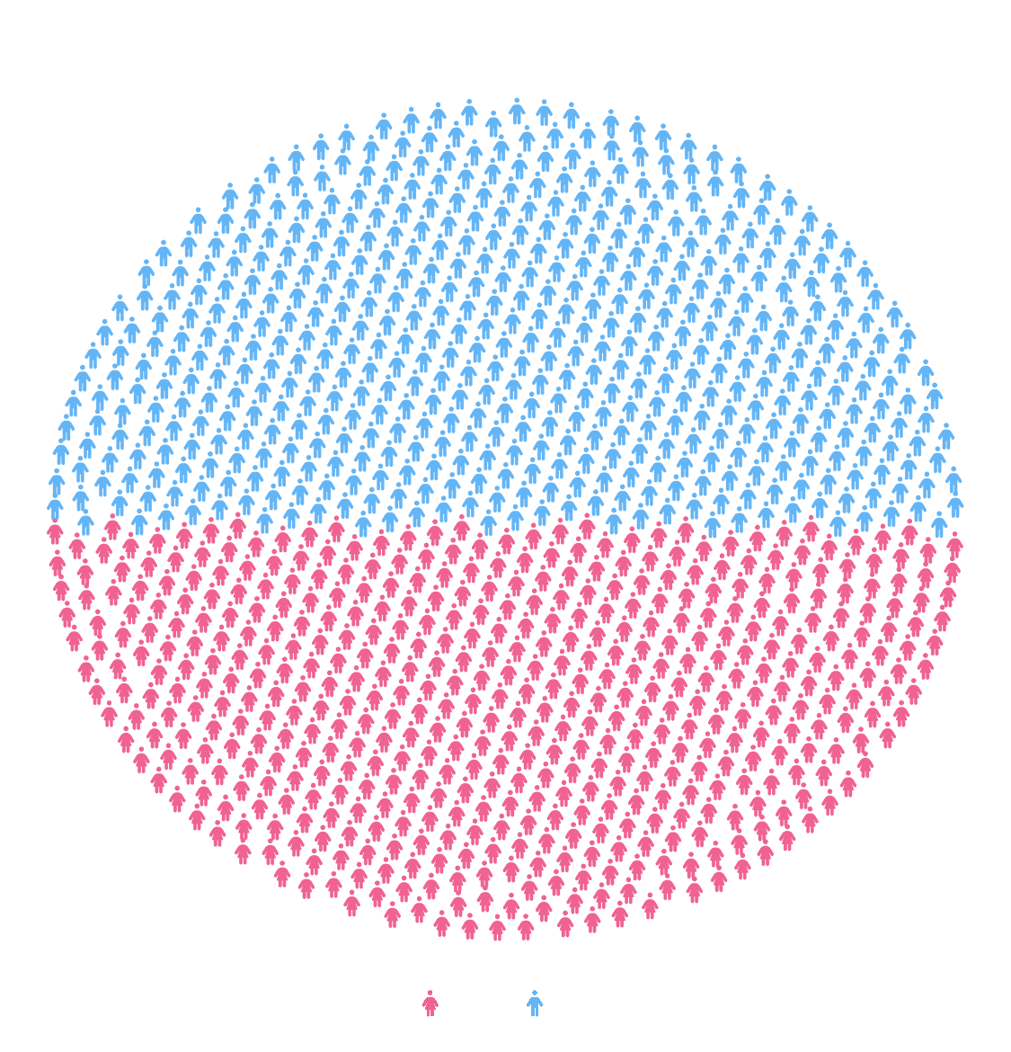
Every icon stands for 130,861 people, the 130.9 million total split across the 1,000 icons process_data() allocated. Blue fills the upper 49% of the circle and pink the lower 51%, which is the sex split in the data.
arrange = TRUE groups the icons so each block stays contiguous rather than mixing the two colors across the circle, and seed = 42 fixes the layout so the chart redraws identically on every render.
The styling is ordinary ggplot2. Title, subtitle, and caption come from labs(), the palette from scale_color_manual(), the dark treatment from theme_pop_dark(). Nothing about the layer is special-cased, so a facet_wrap() or a different palette drops straight in.
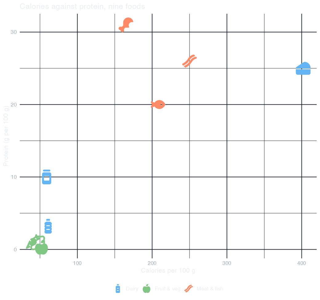
geom_icon_point() needs no preprocessing. Map icon to a column and every row draws as its own glyph, positioned by the x and y you give it. Here nine foods sit on calories against protein, colored by group:
04-icon-scatter.R
df_food <- data.frame(
  food     = c("Apple", "Carrot", "Lemon", "Chicken", "Beef", "Salmon",
               "Milk", "Cheese", "Yogurt"),
  group    = c(rep("Fruit & veg", 3), rep("Meat & fish", 3), rep("Dairy", 3)),
  calories = c(52, 41, 47, 165, 250, 208, 61, 402, 59),
  protein  = c(0.3, 1.1, 0.9, 31, 26, 20, 3.2, 25, 10),
  icon     = c("apple-whole", "carrot", "lemon", "drumstick-bite", "bacon",
               "fish", "bottle-water", "cheese", "jar")
)

p_food <- ggplot(df_food, aes(x = calories, y = protein,
                              icon = icon, color = group)) +
  geom_icon_point(size = 2, dpi = 100) +
  scale_color_manual(values = c("Fruit & veg" = "#81C784",
                                "Meat & fish" = "#FF8A65",
                                "Dairy"       = "#64B5F6")) +
  labs(title = "Calories against protein, nine foods",
       x = "Calories per 100 g", y = "Protein (g per 100 g)", color = NULL) +
  theme_minimal(base_size = 12) +
  theme(plot.background  = element_rect(fill = NA, color = NA),
        panel.background = element_rect(fill = NA, color = NA),
        text        = element_text(color = "#E8EEF4"),
        axis.text   = element_text(color = "#93A6B8"),
        panel.grid  = element_line(color = "#1B242E"),
        legend.position = "bottom")
The icons are the data labels. A legend keyed to nine colors would be unreadable; the glyphs identify each food on their own, so color is free to carry the group instead. Because each group holds three different icons, the legend shows one representative glyph per group rather than all nine.
theme_pop() blanks the axes, which is right for a pictogram and wrong here, so this one uses theme_minimal() with the backgrounds set to NA. That transparency matters: theme_minimal() otherwise paints a white panel over the page.
Overlap is honest. Apple, carrot, and lemon collide near the origin because they really are within 11 calories and 0.8 g of protein of each other. geom_icon_point() has no icon ceiling, so a denser dataset stays workable.
Pass high_group_var to process_data() and a facet to geom_pop(), and each subgroup gets its own circle. facet_wrap() then lays them out:
05-facets.R
df_work <- data.frame(
  region    = rep(c("North", "South", "East", "West"), each = 3),
  work_type = c("Office", "Remote", "Hybrid",
                "Office", "Remote", "Freelance",
                "Remote", "Hybrid", "Freelance",
                "Office", "Hybrid", "Freelance"),
  n         = c(40, 35, 25,  20, 45, 35,  50, 30, 20,  30, 40, 30)
)

df_work_plot <- process_data(
  data = df_work, group_var = work_type, sum_var = n,
  sample_size = 100, high_group_var = "region") |>
  mutate(icon = case_when(type == "Office"    ~ "building",
                          type == "Remote"    ~ "house",
                          type == "Hybrid"    ~ "shuffle",
                          type == "Freelance" ~ "mug-hot"))

p_work <- ggplot() +
  geom_pop(data = df_work_plot, aes(icon = icon, color = type),
           size = 1, dpi = 72, facet = group, arrange = TRUE, seed = 42) +
  facet_wrap(~ group, ncol = 2) +
  scale_color_manual(values = c(Office = "#4DD0E1", Remote = "#FF8A65",
                                Hybrid = "#64B5F6", Freelance = "#FFD54F")) +
  theme_pop_dark(bg_color = "transparent", legend_position = "bottom") +
  labs(title = "Work type by region", color = NULL)
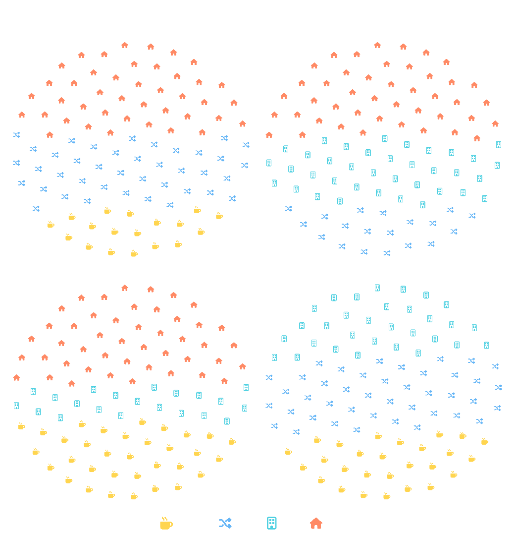
Each circle is its own 100 icons. sample_size applies within each region, so the four panels are comparable as shares even though the underlying counts differ. Read them against each other, not as absolute volumes.
A different icon set per group. The four work types map to building, house, shuffle, and mug-hot, all found with fa_icons(). Shape and color both carry the group, which survives being printed in grayscale.
Small samples scatter. At sample_size = 10 the icons spread thinly and the circle stops reading as a circle. A hundred per panel is where the shape holds at this size.
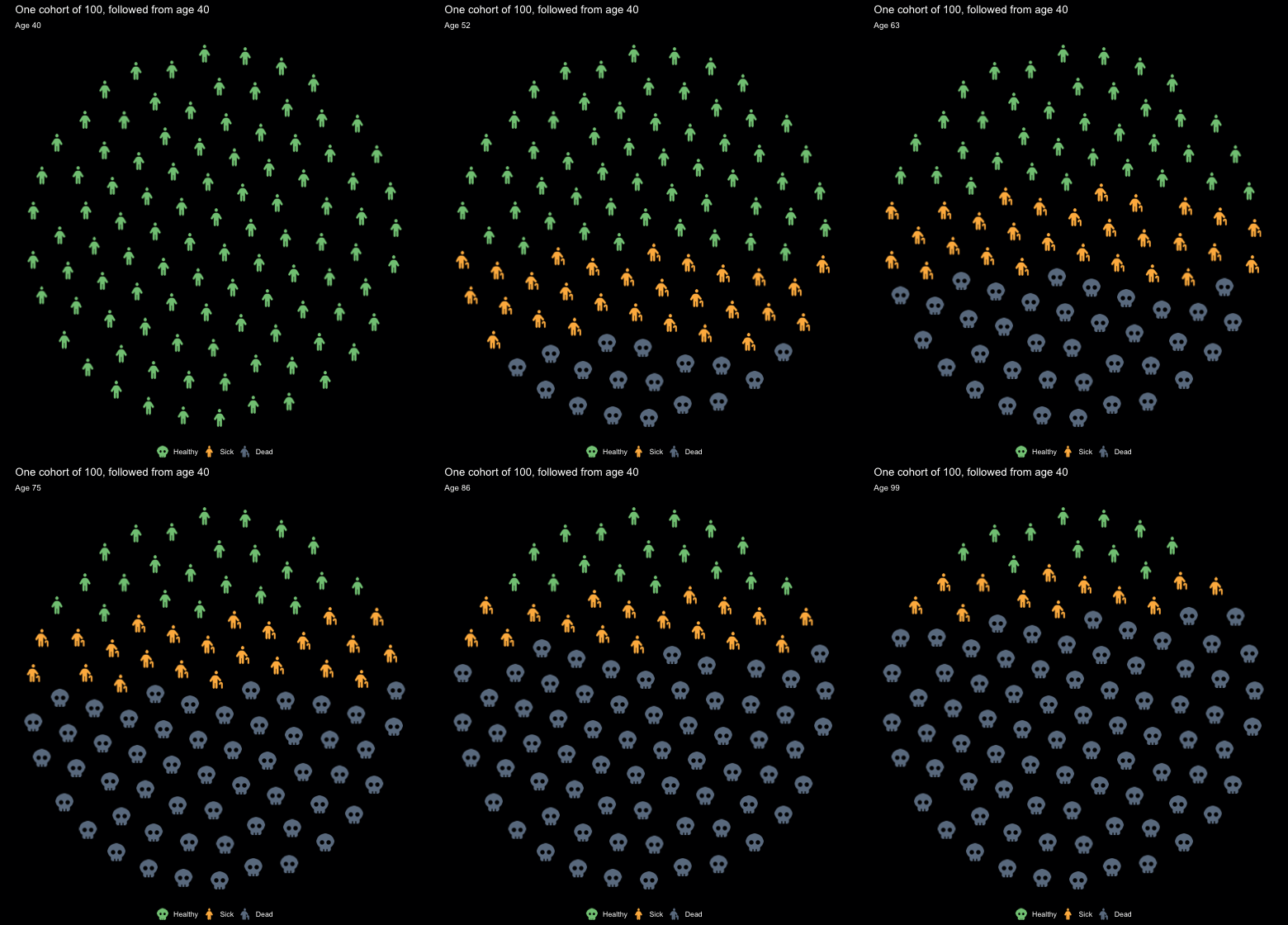
Icons hold still and change state. A three-state Markov model, the teaching workhorse of health decision science, runs one cohort from age 40 in annual cycles, and fetch_df_coordinates() supplies the same 100 circle positions to every frame:
06-animated-cohort.R
library(gganimate)

p_HS <- 0.045; p_HD <- 0.006; p_SH <- 0.02; p_SD <- 0.05
ages  <- 40:100
trace <- matrix(0, length(ages), 3,
                dimnames = list(ages, c("Healthy", "Sick", "Dead")))
trace[1, ] <- c(1, 0, 0)
for (i in 2:length(ages)) {
  h <- trace[i - 1, "Healthy"]; s <- trace[i - 1, "Sick"]; d <- trace[i - 1, "Dead"]
  trace[i, "Healthy"] <- h * (1 - p_HS - p_HD) + s * p_SH
  trace[i, "Sick"]    <- s * (1 - p_SH - p_SD) + h * p_HS
  trace[i, "Dead"]    <- d + h * p_HD + s * p_SD
}

# one fixed 100-icon circle, ordered bottom row first
grid100 <- fetch_df_coordinates() |>
  filter(size == 100) |>
  arrange(y1, x1) |>
  select(px = x1, py = y1)

# fill it from the bottom up: Dead, then Sick, then Healthy
cohort <- lapply(ages, function(a) {
  sh <- trace[as.character(a), ]
  n_dead <- round(sh["Dead"] * 100); n_sick <- round(sh["Sick"] * 100)
  grid100 |>
    mutate(age   = a,
           state = c(rep("Dead", n_dead), rep("Sick", n_sick),
                     rep("Healthy", 100 - n_dead - n_sick)),
           icon  = case_when(state == "Healthy" ~ "person",
                             state == "Sick"    ~ "person-cane",
                             state == "Dead"    ~ "skull"))
}) |> bind_rows()

p_anim <- ggplot(cohort, aes(x = px, y = py, icon = icon, color = state)) +
  geom_icon_point(size = 1.5, dpi = 72) +
  scale_color_manual(values = c(Healthy = "#81C784", Sick = "#FFB74D",
                                Dead    = "#6B7C8F"),
                     breaks = c("Healthy", "Sick", "Dead")) +
  coord_fixed() +
  theme_pop_dark(bg_color = "#000001", legend_position = "bottom") +
  labs(title = "One cohort of 100, followed from age 40",
       subtitle = "Age {closest_state}", color = NULL) +
  transition_states(age, transition_length = 0, state_length = 1)

anim <- animate(p_anim, nframes = length(ages), fps = 12, end_pause = 12,
                width = 520, height = 560,
                renderer = gifski_renderer(), bg = "#000001")
anim_save("assets/cohort.gif", anim)
The circle has to stop moving. geom_pop() computes its layout across the whole dataset, so under transition_states() every frame shows a slice of one big 700-icon circle instead of a 100-icon circle per age. Taking the coordinates directly and drawing them with geom_icon_point() keeps each icon at a fixed seat, so a person changes state in place.
Filling from the bottom turns attrition into a rising grey tide rather than a reshuffle. At age 60 the cohort is 41% healthy, 29% sick, 30% dead; by 80 it is 21 / 21 / 59; by 100, 11 / 12 / 77.
One frame per year, no tweening. Icons are images, so transition_length only crossfades them into each other. Stepping one year at a time instead makes each change small enough to read as motion on its own: transition_length = 0, 61 annual states, 12 fps, and a beat of end_pause before the loop. Years whose rounded composition is identical get merged by gifski, which is why 61 states ship as 49 frames and 250 KB.
The background is baked, not transparent. GIF has only one-bit transparency, which fringes antialiased icons, so the frames paint #000001, the site’s own body color, instead.
This one is not rendered by the page. animate() deadlocks inside a knitr chunk, so the code above runs verbatim from make-cohort-gif.R in this folder and the GIF is committed. Every other figure here is generated at render time.
Still in the documentation and not shown here: facet_geo() for geographic small multiples, ggpop_markers() for the bundled SVG markers, fa_icons() for searching the icon catalog, and a worked cost-effectiveness figure.