Show / hide code
01-install.R
install.packages("ggpop")                          # CRAN
remotes::install_github("jurjoroa/ggpop") # development versionIcon-based population charts for ggplot2
![]()
Turn numbers into people. Turn data into stories.
ggpop is a ggplot2 extension that draws icon-based population charts. It builds on ggplot2 and ggimage and gives you two complementary geoms:
geom_pop() — proportional icon grids where each icon represents a fixed share of the total population (think Isotype-style pictograms).geom_icon_point() — geom_point() with FontAwesome icons instead of dots, free x / y placement, no preprocessing required.Both work as native ggplot2 layers, so themes, facets, scales, and + layer() compose normally.
Population statistics are easier to feel when they’re shown as people-shaped icons rather than as bars or numbers — but in R that has historically been hard. ggplot2’s built-in shapes max out at 25 hardcoded glyphs, and existing pictogram tools either sit outside the ggplot2 grammar, don’t support proportional sampling, or can’t render the icon volumes a real population chart needs.
ggpop was built to close that gap for visual storytelling in policy and public-health work: wire the FontAwesome catalog directly into the ggplot2 pipeline, add a process_data() helper that handles the proportional sampling automatically, and ship the layout primitives needed to make a pictogram or an icon scatter plot in a few lines of code.
Design goals:
ggplot2-native — works inside the grammar of graphics you already knowgeom_pop(), unlimited for geom_icon_point()fa_icons()seed argument fixes random icon layouts for repeatable chartsgeom_pop() |
geom_icon_point() |
|
|---|---|---|
| Best for | Population & proportion data | Any x / y scatter data |
| Layout | Circular proportional grid | Free x / y positioning |
| What one icon means | A fixed share of the total population | A single observation |
| Data prep | process_data() (optional helper) |
None — plug in any data directly |
| Think of it as | A pictogram / Isotype chart | geom_point() with icons |
Install from CRAN or GitHub:
01-install.R
install.packages("ggpop") # CRAN
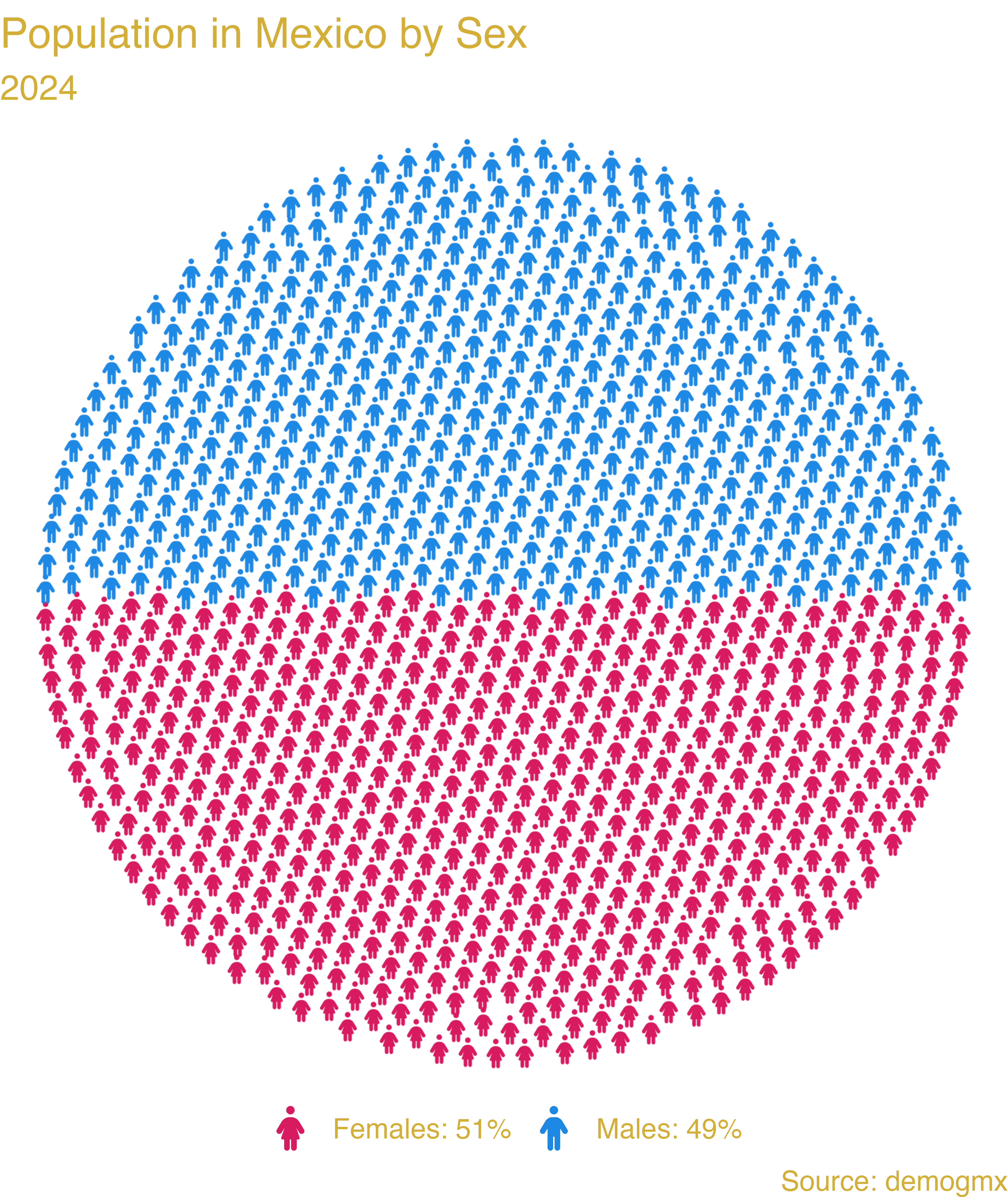
remotes::install_github("jurjoroa/ggpop") # development versionBuild a tiny dataset and run it through process_data() to expand the totals into one row per icon (1,000 icons here, allocated proportionally across the two groups):
02-process-data.R
library(dplyr)
library(ggpop)
library(ggplot2)

df_pop_mx <- data.frame(
  sex = c("male", "female"),
  n   = c(63459580, 67401427)
)

df_pop_mx_prop <- process_data(
  data        = df_pop_mx,
  group_var   = sex,
  sum_var     = n,
  sample_size = 1000
)
Tag each row with the FontAwesome icon name for that group, then plot:
03-plot-pictogram.R
df_pop_mx_prop <- df_pop_mx_prop |>
  mutate(icon = case_when(
    type == "male"   ~ "male",
    type == "female" ~ "female"
  ))

ggplot(df_pop_mx_prop, aes(icon = icon, color = type)) +
  geom_pop(size = 1, arrange = TRUE) +
  theme_pop() +
  labs(title    = "Population in Mexico by Sex",
       subtitle = "2024",
       caption  = "Source: demogmx") +
  scale_color_manual(values = c("male"   = "#1E88E5",
                                "female" = "#D81B60"))
Result:
The full README documents geom_icon_point() (icon scatter plots), facet_wrap() / facet_geo() / gganimate integrations, and a worked cost-effectiveness example.